This is why we will be discussing the CSS box-sizing property. If you are not a complete expert at CSS, it could prevent you from earning premature gray hairs out of frustration.
Yes, CSS has a way of frustrating the hell out of designers, when they try to achieve seemingly simple tasks and things don’t seem to want to play nice.
One such task is trying to keep element sizes while using the CSS padding property effectively.
Here’s the problem. By default, the CSS padding property adds white space into an HTML element totally disregarding the set sizes.
For example, if you set a box 100px by 100px. then add padding of 10 pixels on each side, you will end up with a box that is 120px by 120px in size. To make it worse, should you increase the border thickness, then the problem just compounds.
One way to deal with this is to simply offset the element size to accommodate the padding and the border thickness. This is not an elegant solution to be honest unless you have a calculator on standby.
Enter box-sizing to the Rescue
By using the default box-sizing property on the element, you as the designer have the power to have more control over the correct sizing you need on the said element.
With this property, you can choose to leave the default behavior and leave the element to grow beyond your defined width and height. One such reason you might want to keep the default behavior is when you are adding padding and border around an image.
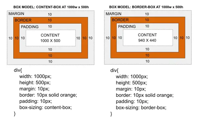
In this case, you might not want to distort the image and you might want to keep the aspect ratio and the defined size. You can explicitly set this by defining a box model that takes the box-sizing value as content-box.
However, if you need to keep the defined width and height regardless of how much padding and border thickness you employ then there is no choice but to get the extra space taken up by the padding and border from the content.
This can be achieved by defining a box model with takes the box-sizing value as border-box. The illustration below shows the effects of using both content-box and border-box.
There are several more CSS tricks that come into play when you are dealing with padding, margin, and border properties to achieve some unexpected visual effects.
Understanding CSS properly is when you will have the power to leverage some of these techniques. So don’t be left behind but find out more interesting upcoming tips and tricks on this website.
Ref: [ 1 ]
Found this article interesting? Follow Brightwhiz on Facebook, Twitter, and YouTube to read and watch more content we post.
