This is the reveal of the definitive Vivaldi 1.0 review. The newest web browser in the market today. So, why would we need a new browser in the market? One would think that the market is already saturated and surely there cannot be a need for a new web browser. Obviously, at least the guys at Vivaldi Technologies seem to think so.
Here at Bright Whiz, we made the announcement about the release of this new web browser and promised to follow it up with a review. After playing around with it for a couple of days, here are our thoughts.
The Obvious Thing to Mention in This Vivaldi 1.0 Review
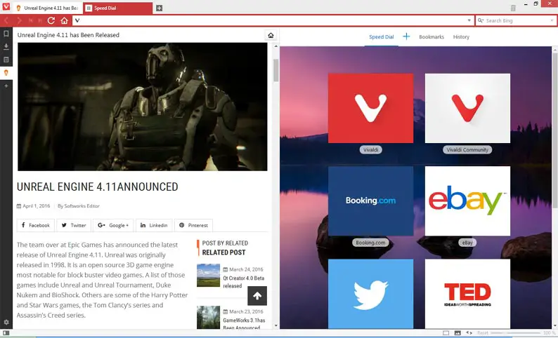
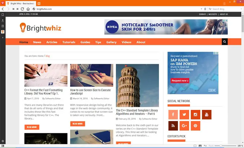
Getting started you will immediately notice that you are no longer using any of the mainstream web browsers. First off you will notice line glyphs used as tool buttons and secondly the tab might be showing a weird color, most likely red. What the latter is, is the browser’s feature whereby the tab adopts the theme color of the website one is browsing through.
Web Panels
We found the web panel feature to be quite useful than originally thought. It is one of the many features in Vivaldi that just grows on you. Those little things you sneak in the midst of your day-to-day work or browsing schedule can be relegated to the side and kept around using the web panel. A handy spot to place Wrike the project management tool.
Page Actions
Another exciting feature we found while writing this Vivaldi 1.0 review was the collection of page actions that generally allows you to mess up or improve the website you are looking at. These range from viewing the website in Black and White, Gray-scale, heck! Even Sepia. You can do some 3D transformations, convert the font to mono-space, skew the content, do some hover magic. It’s amazing what it does out of the box.
Tab Stacking and Pinning
At least a fresher way to organize the numerous tabs you end up accumulating during a browsing session. You can group tabs and organize them as you see fit. Pinning others is an option and even hibernating others makes the experience more pleasurable.
Page Tiling
Vivaldi makes it easier to stack tiles right from the status bar. Interesting how most mainstream web browsers had gotten rid of the status bar. Yet, Vivaldi has found a justifiable need to bring it back. Speaking of the status bar, we might as well wrap up while the topic is still hot.
On the status bar, there is a Zooming slide control on the far right. This gives you a quick way to magnify or shrink the page contents. On the far left, you get a little button for toggling the control panel.
When you mouse-over the tabs you get thumbnails that allows you to take a peek at what page you are dealing with without having to actually change the tab. That is another welcoming feature in Vivaldi 1.0.
Notes and Gestures
Vivaldi 1.0 makes it easier for those such as students and scholars to research and organize their finding. Now you have a browser that lets you highlight text and mark it as a note. You can then access it using the web panel on the left. The note also keeps track of the link within which the quoted text was copied from. The other great thing about this is the text is searchable.
Settings and Customization
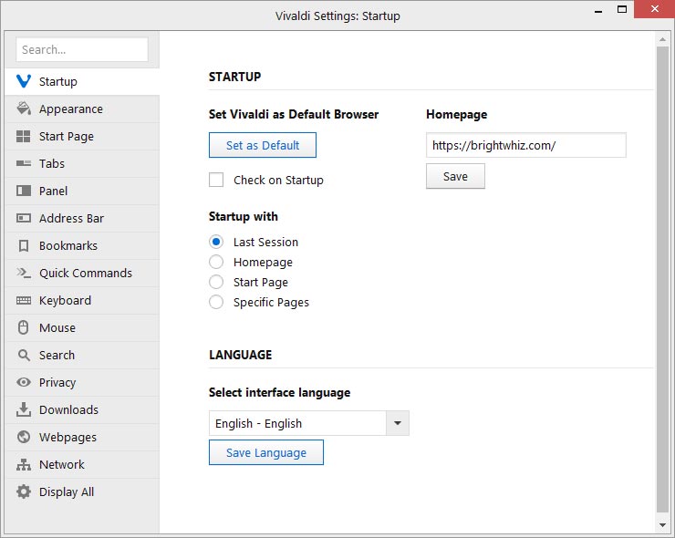
I’m sure that if there is any other descent Vivaldi 1.0 review they too will agree that this is where Vivaldi beats its more mature browsers hands down. Right out of the box Vivaldi comes with more customization options than any other browser I have encountered. Don’t get me wrong. Other browsers have extensions and obviously, Vivaldi comes short in this area. Only time will tell and only then will I judge them accordingly.
With this young and stable browser, you can practically re-arrange the tab positions, the menu bar at the top, the web panel locations, the speed dial background, the theme colors, fonts and generally everything that you can see on screen. Some features are present in the other more popular web browsers. One feature that is not present in other browsers is the mouse gestures.
Mouse Gestures
This browser allows you to customize mouse gestures to control the better aspects of your web browsing and tab organizations. You can customize the gestures as you see fit and the best thing of all is that they actually work really well. This comes in as an add-on and complement to the keyboard shortcuts which can also be customized.
Cons
Even though I think this is an amazing browser, obviously from the favorable comments in this Vivaldi 1.0 review, I still have an issue with the memory consumption. All web browsers suffer from this. It will be great to see the day when a web browser can boast a multitude of features and do it with just a pinch of memory.
The other thing I would have loved to see in Vivaldi 1.0 is the features geared towards the developers. Google Chrome comes with built-in developer tools and so does Firefox more-so through the Firebug browser extension. The other mainstream browsers are not left behind too when it comes to attending to developer requirements. It will be a lovely day when Vivaldi implements developer features.
Finally, don’t take our word for it. This is just a Vivaldi 1.0 review to whet your appetites. Get your first copy of this fresh web browser from the official website download link and give it a test run as well and share with us what you think. It’s free!
Found this article interesting? Follow Brightwhiz on Facebook, Twitter, and YouTube to read and watch more content we post.


